


in Education
- Community
- Topics
US En
Connect with an expert
Do you have an Intuit account?
You'll need to sign in or create an account to connect with an expert.
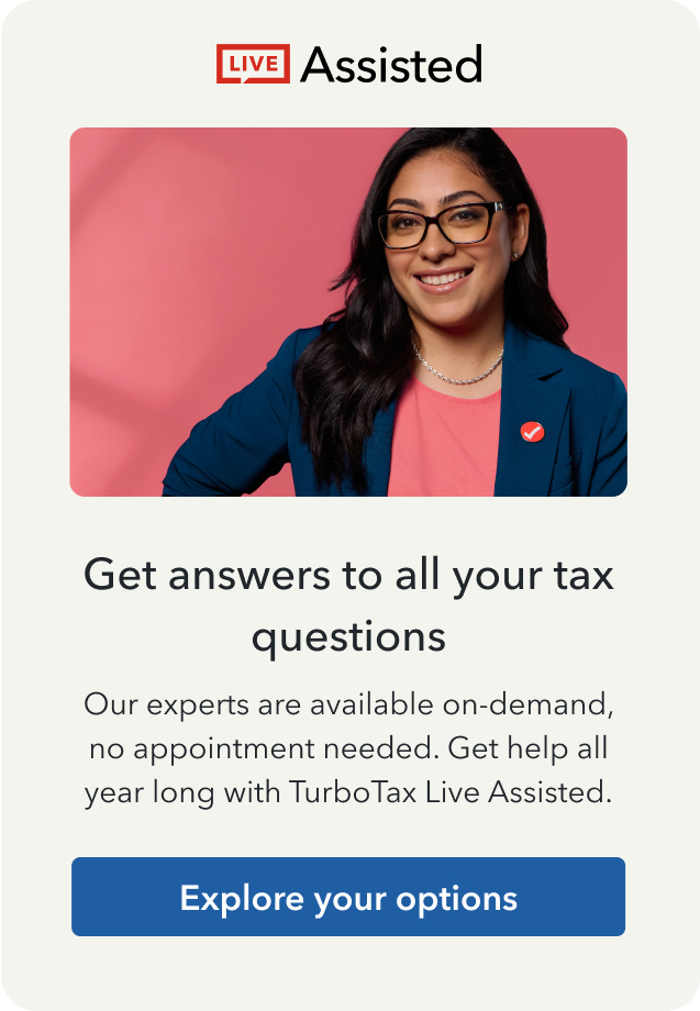

Get more help
Ask questions and learn more about your taxes and finances.
Related Content


