- Community
- Topics
- Community
- :
- Discussions
- :
- Taxes
- :
- Get your taxes done
- :
- Accessibility: Can you please improve your fonts so the text is more clear?
- Mark as New
- Bookmark
- Subscribe
- Subscribe to RSS Feed
- Permalink
- Report Inappropriate Content
Accessibility: Can you please improve your fonts so the text is more clear?
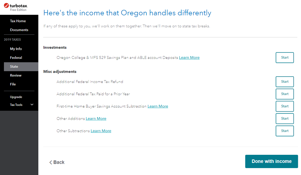
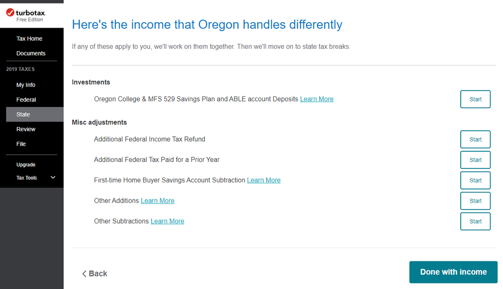
Some text on your site is horribly thin and very difficult to read.
The font that is used is in these cases is "Avenir Next forINTUIT", which seems to be causing the issues. You can edit the font-weights to slightly improve it (via inspector), but there are instances where it's bolded and certain characters don't behave correctly (like the "S"). Removing this font from the font stack and just using "Avenir" seems to fix the issue for the most part. These fonts are applied to the "#unified-root" selector as well as the several heading tags and the body.
I suggest that you adjust these soon, as this seems to be an accessibility concern.
Here are some comparisons of my tax filing process.


Do you have an Intuit account?
You'll need to sign in or create an account to connect with an expert.
- Mark as New
- Bookmark
- Subscribe
- Subscribe to RSS Feed
- Permalink
- Report Inappropriate Content
Accessibility: Can you please improve your fonts so the text is more clear?
This is mainly a user community forum, but I flagged your thread for a Moderator to review.
- Mark as New
- Bookmark
- Subscribe
- Subscribe to RSS Feed
- Permalink
- Report Inappropriate Content
Accessibility: Can you please improve your fonts so the text is more clear?
Appreciate it. Saw some other font-size related issues and figured it'd make sense to post here. Wasn't sure if there was a proper channel for this type of feedback. If there is, let me know!
- Mark as New
- Bookmark
- Subscribe
- Subscribe to RSS Feed
- Permalink
- Report Inappropriate Content
Accessibility: Can you please improve your fonts so the text is more clear?
Thank you for taking the time to craft this thread and post it to the community. We will pass this feedback along to our colleagues.
Happy Filing & thanks again.
**Mark the post that answers your question by clicking on "Mark as Best Answer"
- Mark as New
- Bookmark
- Subscribe
- Subscribe to RSS Feed
- Permalink
- Report Inappropriate Content
Accessibility: Can you please improve your fonts so the text is more clear?
@Anonymous @GabiU
jsun the issue you have described has been raised with TTax in previous years as well (though not necessarily limited to that specific font --other concerns have been about various colors used in various screens.
The answer that has resulted is that while many of the TTax peopls may agree with the various complaints, the choices are made by corporate Intuit people who are concerned solely about corporate 'standards' and are not necessarily concerned about user complaints. Don't hold your breath waiting for changes or answers.
- Mark as New
- Bookmark
- Subscribe
- Subscribe to RSS Feed
- Permalink
- Report Inappropriate Content
Accessibility: Can you please improve your fonts so the text is more clear?
@GabiU Thanks. Looking forward to some improvements. Hope this helps others.
Also, is there a proper place to submit feedback like this?
- Mark as New
- Bookmark
- Subscribe
- Subscribe to RSS Feed
- Permalink
- Report Inappropriate Content
Accessibility: Can you please improve your fonts so the text is more clear?
This was the proper channel to turn to--thank you.
**Mark the post that answers your question by clicking on "Mark as Best Answer"
- Mark as New
- Bookmark
- Subscribe
- Subscribe to RSS Feed
- Permalink
- Report Inappropriate Content
Accessibility: Can you please improve your fonts so the text is more clear?
Thanks for the thread and acknowledging that several people have taken the time to ask for a larger, more accessible print. As a disability advocate until my retirement, this is inexcusable. An ADA complaint should be filed with the US Office of Civil Rights. This is akin to not providing an alternative to stairs in a building.
Still have questions?
Questions are answered within a few hours on average.
Post a Question*Must create login to post
Unlock tailored help options in your account.
Get more help
Ask questions and learn more about your taxes and finances.
Related Content

dfarrell
New Member

merlinsherbals
New Member

ebonysimone
New Member

chriswilson5568
New Member

paru-m-naik
New Member

