Anonymous
Not applicable
- Mark as New
- Bookmark
- Subscribe
- Subscribe to RSS Feed
- Permalink
- Report Inappropriate Content
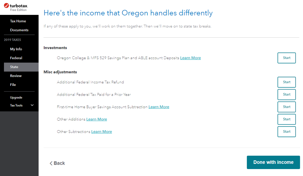
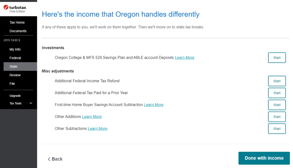
Accessibility: Can you please improve your fonts so the text is more clear?
Some text on your site is horribly thin and very difficult to read.
The font that is used is in these cases is "Avenir Next forINTUIT", which seems to be causing the issues. You can edit the font-weights to slightly improve it (via inspector), but there are instances where it's bolded and certain characters don't behave correctly (like the "S"). Removing this font from the font stack and just using "Avenir" seems to fix the issue for the most part. These fonts are applied to the "#unified-root" selector as well as the several heading tags and the body.
I suggest that you adjust these soon, as this seems to be an accessibility concern.
Here are some comparisons of my tax filing process.


January 25, 2020
12:06 AM
