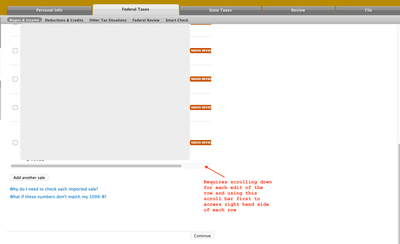
The UX for turbotax Mac on edit screen for Stocks is cumbersome. It restricts the horizontal screen to a window which doesn't display the edit pencil icon on far right on the screen (Even if application is maximized), even though there is lot of white space on right.
It's cumbersome since you can't just scroll right at top, you have to first scroll down to bottom to access the horizontal scroll bar and scroll to right and then go back to top to edit the first row and so on. It's spending time depending on how many entries might need to be edited (especially for Options where edits might be required it becomes painful experience).
Edit window constrained to some size and doesnt expand/leverage right hand white space

Require scrolling to bottom, for editing every row in the list, to access the scroll bar at bottom

After scrolling at bottom of the list to access edit buttons and requiring going back to top (if the first row is to be edited).

Not sure if Turbotax has any UX team to get a better user interface.
- Either the edit window is not restricted and allowed to expand to right to show all fields including edit and delete button
- Or allow mousepad scroll to right at the top to allow horizontal scroll bar control which will allow user to access edit using mousepad

